Love

Love

Thursday, 16 April 2015

16th April

Kraft + (take 2!!!)

 
Yep, this is my second go at this - I blogged the first one, but didn't end up entering it in the challenge... I just wasn't that keen on it...
 
So, this is the challenge....
 
 
And THIS is my layout which I will upload to the Kraft + site!
 

Together - On Top Of The World.


This is how I used the recipe:
All colours accounted for.
Washi tape - silver chevron, layered with the paper
Silver - covered in the above (washi tape)
Spots - blue paper, white spots
3 tags - 1 above, 2 to the right of image (private journaling)
Stamping - light around the edge
Cotton - stitching it all together!

AS far as the Retro theme goes - just as a coincidence - the skirt Bree has on did belong to my mother and Bree found it and claimed it - from the Dress Up box!
 
 
I can only upload a 12 x 12 image, so this is what will show for the challenge....


 And here are some close ups.....


The photo below was taken for a particular reason.... Bree's small cousin loves volcanos, and the kids loved the way she explained how they erupted. So, we took these photos for Ellie, with Bree and Chris re enacting her actions. Too cute!


These photos are quite bittersweet to me... the photos were taken in January this year, in Bali, where I met up with Bree and Chris.  We had a lovely 4 days... and then I had to say goodbye to her (them!) because they were on their way to England - to MOVE TO ENGLAND!!! Which is fine for Chris (lol) - he is English... but my baby loves him, and is moving there with him!
It was really lovely to see them... so happy and in love, and starting their amazing new life together - BUT.... I will miss her (them!). They really do seem like they are On Top Of The World!!!
 
Thanks for popping in!
Cheers, Vicki
 
PS. This was actually take 3 - I forgot to add my cotton!
 

Thursday, 9 April 2015


9th April

Kraft + April Challenge


I quite liked this challenge - when I started!


I knew straight away which papers I was going to use and had a plan!
I enjoyed the process, but not the result so much!
 
I used Graphic 45 Typography and a photo of my new journal, featuring a blank page.   I think I have ticked all the boxes, but am not loving the silver/bling business with the G45.  I couldn't get it to work.... the bling is supposed to be the creative magic and courage pouring out of the journal as I play in it! 
 

My New Art Journal


And some close ups....


However, I have started another one, that I think I might like better...  we will see!
9th April

CSI Case File 159

http://csicolorstoriesinspiration.ning.com/forum/topics/case-file-no-159-case-closes-on-april-9-2014

I have nearly left this until the last second! It scared me!!!!
It is so pretty, but I think it was the blue....
Anyway, I have recently bought myself some (very expensive!!!) water based wax crayons, so I decided to give them a whirl.... so much fun, and so relaxing. Of course, I didn't have the exact colours, (should have bought the bigger set lol!) but a bit of blending and I was happy with the result. And I am very pleased with how it all came together... quite quickly after I started. Who knew?


Here is my All Good layout, based on this case.


Scheme: All colours accounted for.
Evidence:  doodling (with water crayons), flowers and leaves (fussy cut and paper flowers), grid pattern (Kaisercraft grid stamp), stamps (grid and lacy diamond), jewels (hat pins and bling), decorative border (added colour to the already beautiful border on the Prima paper), love accents (a couple of hearts and I spread the title (almost) across my photo.
Testimony: I journaled into the border of my cluster, and used the word Love, which also features in the sub title at the bottom left corner.

Here are some close ups...


And some of the supplies I used....


This turned out so much better than I thought I could make it!
Loved the challenge of it all!
Another case - solved!
 
Cheers, Vicki


Monday, 30 March 2015

30th March
 

1,2,3 Challenge

 
I came across this challenge site last month, and I like the concept - again, the 3 prompts are quite open, so will produce many different options for creating.  The colour got me in this one - has to be my favourite... well, one of them..


Here is my entry

Beautiful.

 
And a couple of close ups.
 
 
 I took these with the sun streaming in the window... and love the way the shadows happened, and make the bling "pop"!
 
 
This layout is loaded with Blue Fern Designs... paper, chipboard title, twiggy tree and sea shells.  I painted the sea shells and title with H2os, embossed the twig to look like coral, and added some Scrap Matrix Vintage trinkets (the metal shells) with some Prima bling and some micro beads. Love the way it tall came together...
 
Cheers, Vicki

Thursday, 26 March 2015

March 26th

CSI Case File No 157

(Colour. Stories. Inspiration.)
 
Here is the link, but this challenge closes in a few days,
so be quick!

As soon as I saw this case, I knew what I wanted to do... I was easily lead!  My cat, my camera.... and grids. Surely I could not go wrong!  Then I noticed the RED - eeeek!!! 
But, by then I was on a mission, and I think I even managed to get close to the sketch.
 
This is the major case for the month, so it incorporates a sketch to go along with it.... just to make it more interesting! lol


Here is my layout - "CLICK"

(The reflection of green under the top right photo of HenLi is actually black Glossy Accents, and has reflected my yard!).
And why doesn't my white paper look white????
I take good photos - unless they are of layouts... and I have tried so many options to get it right!


Scheme: All colours accounted for.
Evidence: Grid pattern (background, using Distress Stains), Camera (vintage trinkets and stencil with texture paste), metal (trinkets), hearts (engraved on the locket trinket), string (I actually used ribbon...), Polaroid Frames (die used).
Testimony:  "CLICK"
Sketch: Is loosely followed... I was 'inspired' by...
 
Here are a couple of close ups...
 
 
 No deep and meaningful journaling here.... but reflects my love of HenLi, my camera, my photos - and ultimately why I am so passionate about scrapbooking. It just brings it all together!

 
Loved adding so many little photos of HenLi, coming straight out of the Polaroid!
 
Thanks CSI, another case solved - and enjoyed!
 
Cheers, Vicki
 

26th March

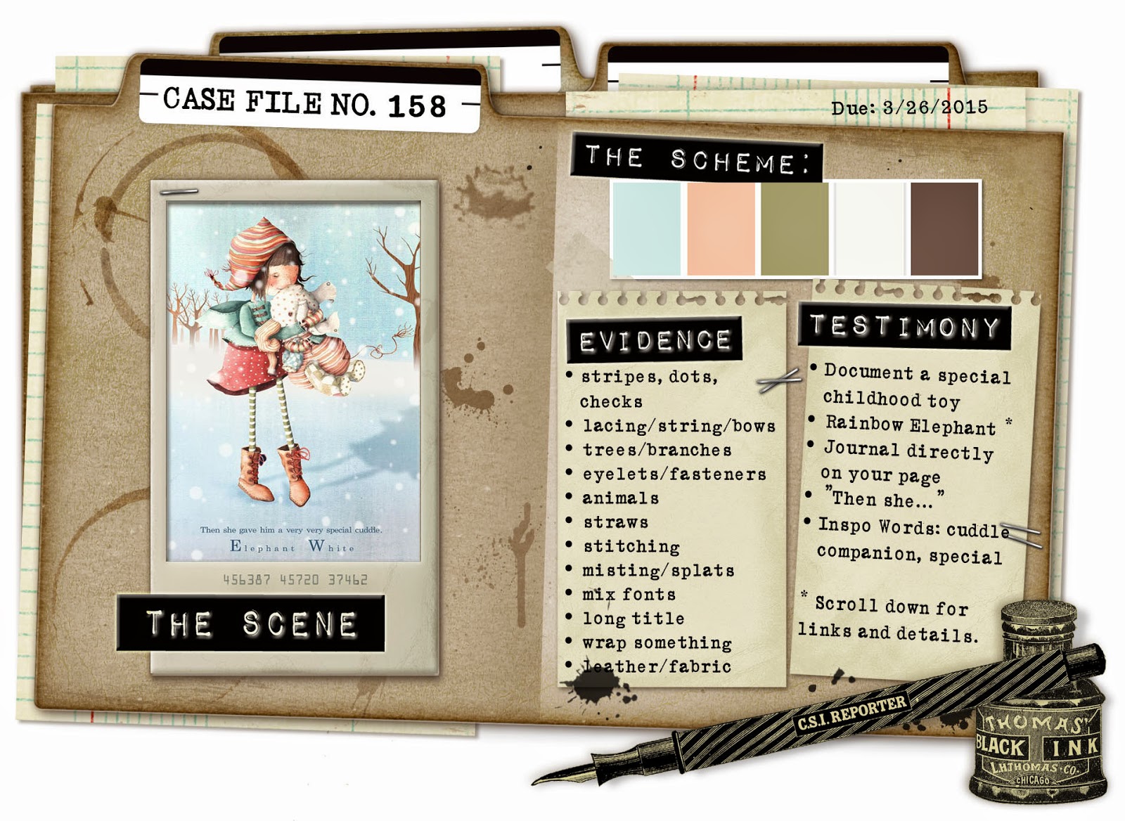
CSI Case File 158


Back again with another case, and for a while these pastel shades had me going...  then I remembered this Prima range I have been hanging onto, and figured I could make it work... and away I went.
 
Here is the link....
http://csicolorstoriesinspiration.ning.com/forum/topics/case-file-no-158-case-closes-on-march-26-2015

 
Here is me, solving the case, my way!
(I think I need a tutorial on how to take great shots of layouts.... anyone know one????)
 

"OUR NEIGHBOUR LIVED IN A TREE"


The Scheme: All shades accounted for (in the paper, gelatos - in the background to enhance the scheme colours, with the embossing powder).
Evidence: dots (3D gel stenciled dots), lacing (leaves laced through Blue Fern Designs splattered circle chipboard), trees and branches (chipboard) animals (my photo!), misting/splats, mix fonts, long title.... lots of evidence collected.
Testimony: Journal directly onto page, and the word "special" is included in the journaling.
 
Here are a couple of close ups too....


This was so much fun, as usual... I love CSI, and the way it makes me think!
I am off to solve another case!!!
PS A new one is released tonight (well in Australia, it will be the morning...)
 
Thanks for stopping by... Cheers, Vicki
 

Tuesday, 10 March 2015

11th March

CSI Case File 156

 
I may have mentioned that this is my favourite challenge site...
I love the way it makes me think, and inspires me to include different elements, sometimes ones I would not normally use together. And because there is so much evidence to choose (at least 2) from, the variety of styles and layouts entered is always amazing to see.... I love seeing what other scrappers come up with!
 
This is such a pretty palette, I immediately went to look at some of my 'garden' snaps... Not that I am a gardener, but do have limited success ( a little bit...) on occasion.... (read below!)


Let The Sunshine.


The Scheme: all colours accounted for.
Evidence: text print, cursive font (let the), leaves, mixed media background, liquid pearls.
Testimony: A Little Bit (in the journaling)
 
 
And a few close ups...


Thanks for stopping by, I love it when you leave a comment...
 
Cheers, Vicki. xx